
CodeBranch · Product: YMA / Smartel · Jun 2025 – Apr 2026 (contract)
Designing an AI Ecosystem from Zero to One
Establishing the foundational product experience for a computer vision AI platform: mobile-first design, real-time feedback patterns, and a design system scaled by a growing team.

A 0→1 computer-vision product with no design patterns, component library, or interaction conventions.
Established mobile-first, real-time-AI feedback patterns and a documented design system scaled by 2 designers.
A full product experience shipped across mobile, tablet, and desktop from a single design system.
No existing patterns. Multiple product surfaces. Real-time AI data.
YMA is part of the Smartel AI ecosystem, a product suite powered by computer vision and real-time data processing. When I joined, there was no established product experience: no design patterns, no component library, no interaction conventions.
Designing for real-time AI data. Computer vision generates continuous, high-frequency output: confidence scores, object detection results, threshold alerts. The interface needed to communicate this data clearly without overwhelming users or introducing latency-induced confusion.
Mobile-first for field use. The primary users interact with the system on mobile devices in real-world environments. Every interaction pattern had to work reliably on small screens, in variable lighting, with one-handed operation.
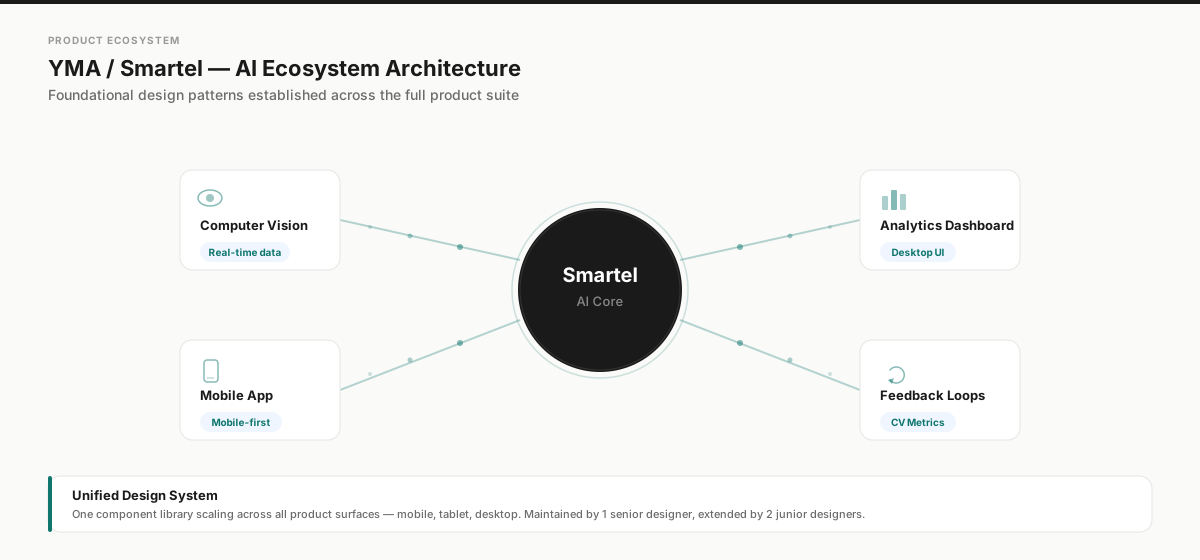
Smartel AI ecosystem: unified design system scaling across all product surfaces

- Scores in display type: legible at arm’s length, outdoors
- Technique / posture / stride update live against visible thresholds
- Dual synchronized views, front + side, on one timeline
- Built mobile-first: controls sit in the thumb zone
Contestant Review: live AI scoring (technique, posture, stride) over dual-view video
Try the Design / Spec toggle

The considered empty state: clear affordances and layout before scoring begins

Contestant settings: admin data table with search and bulk management on tablet

Contestant list: mobile-first responsive design with avatar cards
Built to scale through other designers.
The component library shipped with its documentation built in, so the system could be extended without me in the room. Two junior designers took it across the product suite while keeping the language consistent.
Every component was designed mobile-first and scaled up to tablet and desktop, not the other way around. Touch targets, information density, and navigation patterns were all optimized for one-handed mobile use before being adapted for larger viewports.
Leadership & Collaboration
- Team enablement: Built comprehensive component documentation (usage guidelines, interaction states, responsive behavior, and engineering annotations) so 2 junior designers could contribute autonomously across the product suite.
- Decision rationale: Chose mobile-first over responsive-desktop-down because field users (the primary audience) need one-handed operation in variable conditions. Desktop was the adaptation, not the source.
- Cross-functional coordination: Aligned with 5+ engineers across mobile, web, and AI/ML teams to ship a unified design language across the entire Smartel product ecosystem.
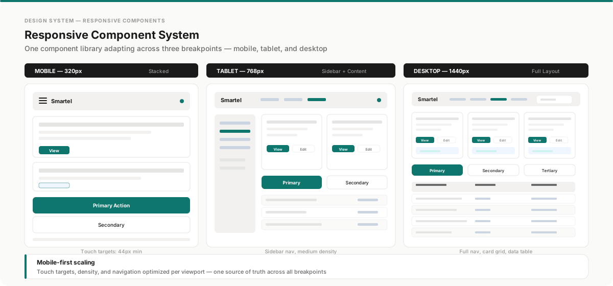
Scalable component library with documented responsive behavior, enabling autonomous team contribution
Shipped across every surface: mobile, tablet, and desktop.
The mobile-first approach translated into a cohesive experience across all device types. The landing and enrollment flow adapts from a full desktop layout to a touch-optimized mobile experience, while the contestant management interface scales from a compact mobile list to a full data table on tablet.

Landing & enrollment flow: desktop

Landing & enrollment flow: mobile

Contestant management: tablet data table with full navigation

Contestant management: mobile list optimized for one-handed use